Hi Everyone,
This post is going to deal with my love for Styling, Photography, and Graphic Design. The art in question is the latest issue of British GQ with Rihanna as the feature.
I am going to start with the Styling and Photography. I love the way they are playing off her new hair color with the backdrop colors and the dusty rose lingerie they chose for her to wear. I also like how they showcased her tattoos.

I love the blur effect that they did with this shoot. It adds an extra dimension to the photos and lessens the contrast between the black and burgundy. The strawberries and cream was a great addition. No other fruit says sex more than strawberries; it doesn’t hurt that they are red either!

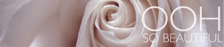
This is my favorite shot from the shoot. The roses and her hair match perfectly and the satin lingerie and stilettos mimic the texture of the rose petals beautifully.

Lastly, I wanted to discuss the use of Graphic Design in these spreads. To be honest, I think that I enjoy the GD more than anything else. LOL
This is the cover and the feature page. I love that they played with the perspective of the type to mirror the photograph, usually this ‘Star Wars’ effect can be kind of cheesy, but I think they pulled it off quite tastefully here. I feel like the photography and the type are interacting quite nicely.

The interior pages are a great follow-up to the previous pages. I love how they used the body copy to complete the bar of the ‘R’. and the ‘alert’ in the D on the opposite page. Simple concepts, but huge impact… As they say, it’s all in the details!

*Photos courtesy of Rihanna Daily and GQ.*


